Have you noticed how people have started using posters to decorate their homes? There are several reasons posters are great for this, but we would like to single out two: the ability to choose a design according to your interest, and the fact that they are more affordable than other works of art.
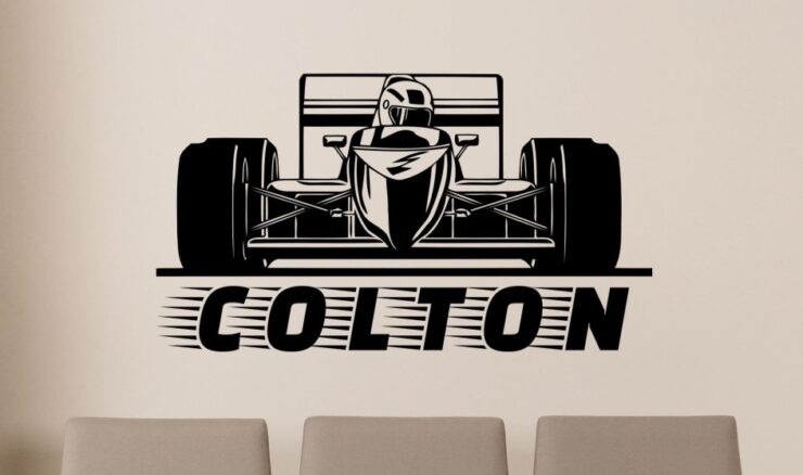
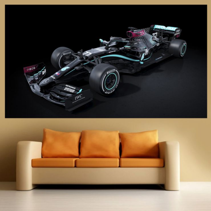
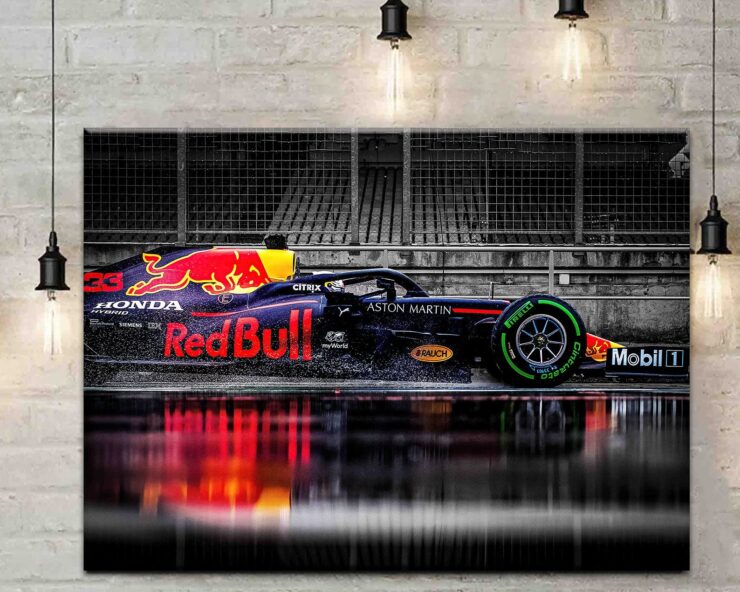
For example, creating a wall gallery consisting of formula 1 posters is one of the easiest ways to bring your own style and personality to a space. In addition, it is an ideal solution when we want to quickly refresh the room, cover up individual wall defects or fill in their gaps. But, for the end result to really be wow, we need to know what not to do with Formula 1 posters. Hence, we’ve created an article to help you avoid some common mistakes when decorating your walls with Formula 1 posters.
1. Placing them in the wrong room

When it comes to placing a formula 1 poster, the most common mistake people make is not planning where to place them, resulting in a poster not being noticed, or not being synchronized with the rest of the room.
Although illustratedtracks posters are most often seen in living rooms, when positioned well they can look great in any room. Therefore, they can be a great solution for bedrooms, offices, children’s rooms, and even bathrooms and toilets.
2. Determining the wrong position
In order for the Formula 1 posters to stand out, it is best to plan to place them on walls that are as empty as possible. After choosing a location, we measure the wall to define the most suitable frame layout. This decision is also influenced by how our home is arranged, whether the furniture is bulky, whether we have a lot of empty space, whether the apartment is in the attic, etc.
Here are some tips on how to position them:
- It is recommended to use the museum rule, according to which the distance from the floor to the middle of the frame is about 160 cm. Another option is for the central point of the gallery to be at eye level.
- A few centimeters “up and down” in the layout can really affect the vibe of the room. If we want to achieve an airy, “uncluttered” appearance of the room, one of the tips is that the minimum distance of the frame from the ceiling, corners, or furniture such as a sofa should be 20-25 cm. If our priority is the cohesion and comfort of the room, we move the frames a few centimeters closer to the sofa or chest of drawers.
- If we want to achieve a uniform look, it is preferable that the frames are the same color, with equal spaces between them. If the goal is to achieve a spontaneity vibe, it’s best to go for different spacing widths between different frames.
3. Not considering the size of the furniture in the room

As was mentioned a couple of times earlier, you want your formula 1 art to really be seen by people who visit you. To be synchronized with the rest of the room, and to do this, you also need to consider how big is your furniture. If we have massive furniture, it is preferable to choose larger frames because smaller posters will get lost in the space.
It is usually not advisable to place them near the TV, but above the sofa, headboard, fireplace, dining table, or chest of drawers. Also, let at least one wall in the room remain empty so that the eyes can rest and other decorations can stand out more.
4. Failing to choose the right the style
As you have noticed, formula 1 posters come in a variety of styles. So, you can choose from anything vintage illustrations in color to minimalist illustrations of the race tracks. According to the style of the room, you should be choosing your posters.
Combining is also an option. With large wall galleries, it is preferable to use one or a maximum of two styles, depending on the decoration of our home. When choosing a style, the most important thing is the consistency of the room in which it is located, so we should decide:
- does our furniture go with an asymmetric arrangement or a regular grid of frames;
- whether a monochromatic palette or vibrant colors suit the room;
- will the frames be the same or will they differ in color and thickness?
Uniform galleries can strive for minimalism and elegance, while a few brightly colored formula 1 posters and a couple of black-and-white photos of different dimensions can result in an eclectic vibe.
5. Not thinking outside the box

People who feel passionate about race tracks have usually attended some of these events, and perhaps even collected a couple of items reminding them of the experience. Some are even collecting different souvenirs on the topic and would like to combine them with posters, putting everything on display.
If we want to maintain complete flexibility when organizing frames and posters, because these collectibles are something we expand over time, there are narrow shelves that are designed specifically for placing frames. They do not take up a lot of space, and they give us the freedom to change the layout without frequently drilling holes in the wall. It is recommended that the frames be of different sizes in order to achieve a layered look, and we can combine them with other souvenirs and collectibles we’ve mentioned earlier. It’s something like creating a thematic wall display.
Finally, there’s one last thing we’ve failed to mention when it comes to what not to do with formula 1 posters. It includes not framing them. When you make a purchase, they usually come unframed, and it is up to you to decide on the suitable one. Keeping them unframed for a long time can damage the material, and ruin the appearance of your formula 1 poster.
Related Posts:
- 20 Best Gaming Headset Under 50$ 2024 - for PC, PS4,…
- 15 Best Dog Food For Allergies 2024 - Adult, Puppy…
- Top 16 Best Office Chair Covers 2024 - Chair…
- 12 Best Car Wax For Black Cars 2024 - Protection and…
- 10 Best Climbing Harness of all Time 2024 - Opinion…
- Top 10 Best Dog Nail Grinder 2024 - Best Care for Your Pet


